


Premium cosmetic packaging design service – Shirohada project
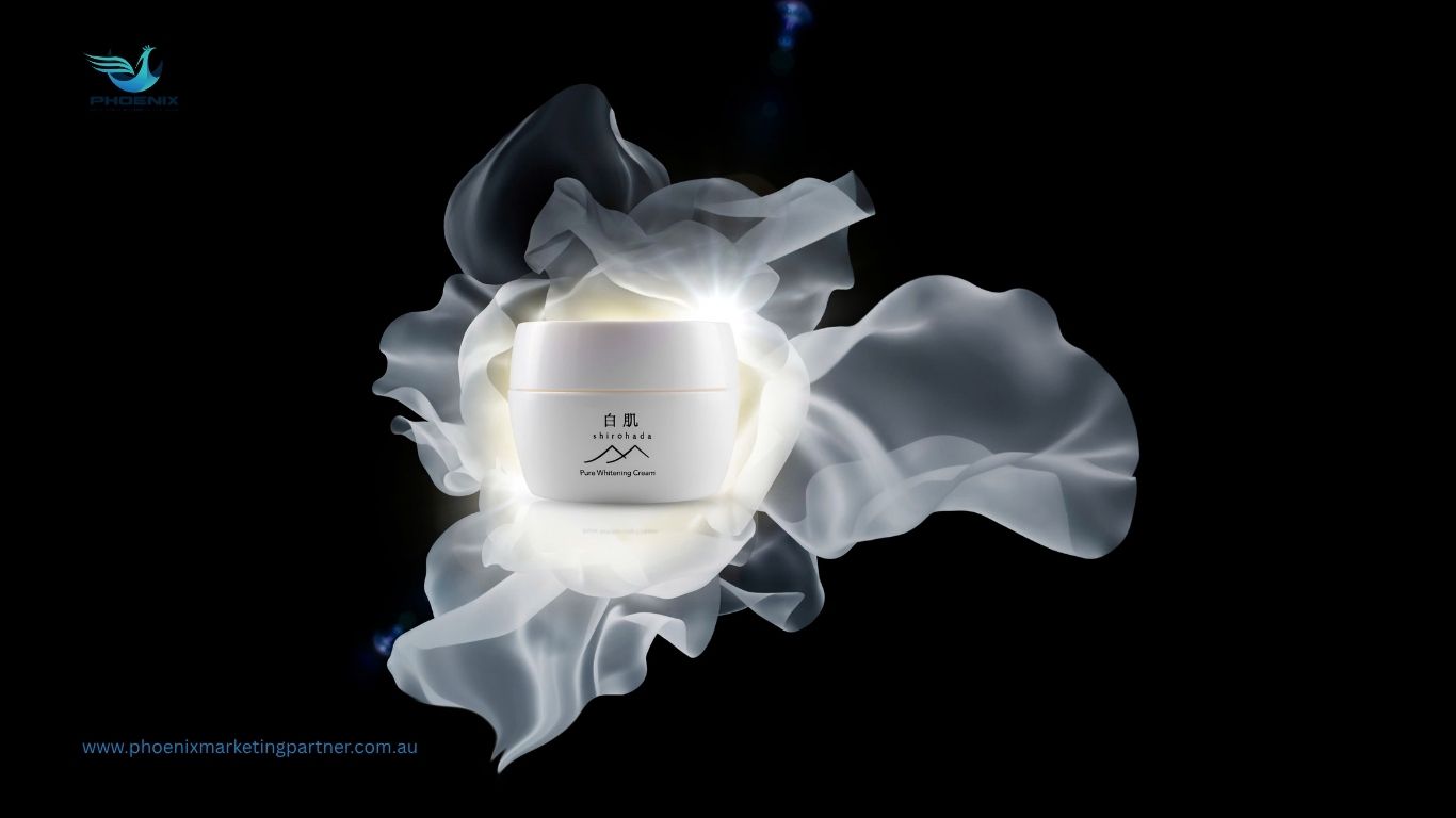
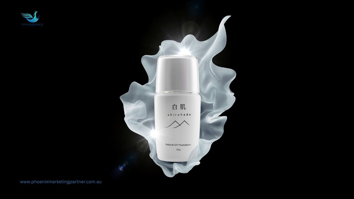
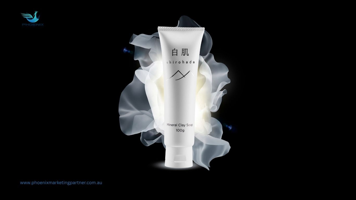
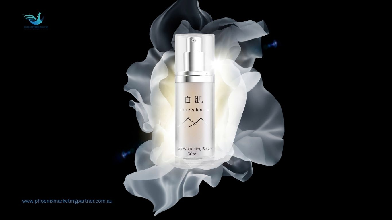
Project Information
- Clients Shirohada Skincare Brand
- Start Date 1 Aug 2024
- End Date 15 Aug 2024
- Duration 1 Week
Project Details
In today’s highly competitive beauty market, packaging is no longer just a protective layer it is a strategic branding tool. Therefore, the Shirohada project was developed with a clear ambition: to transform packaging into a visual storytelling system that communicates purity, elegance, and trust at first glance.
Rather than following conventional cosmetic design trends, Phoenix approached this project with a more refined perspective. As a result, every design decision was rooted in brand positioning, customer psychology, and retail visibility.
1/ Project Objectives
From the very beginning, the project focused on three core objectives.
First, the packaging needed to communicate a sense of premium quality instantly. Moreover, it had to differentiate Shirohada from a saturated skincare market filled with visually similar competitors.
Second, the design had to reflect the brand’s core philosophy of natural beauty and skin purity. Therefore, visual elements were carefully selected to evoke softness, clarity, and authenticity.
Finally, the packaging system needed to be scalable. In other words, it had to maintain consistency across multiple product lines while still allowing flexibility for future expansion.
2/ Design concept: Purity meets minimalism
Instead of overcomplicating the visuals, Phoenix chose a minimalist direction. However, this minimalism was not about simplicity alone it was about intentional clarity.
The concept centered around “pure beauty from nature.” Therefore, clean layouts, balanced spacing, and subtle details became the foundation of the design language.
Moreover, unnecessary decorative elements were eliminated. As a result, the packaging achieved a refined, premium look that immediately builds trust with consumers.
When is it time to redesign your brand identity?
3/Visual language & color strategy
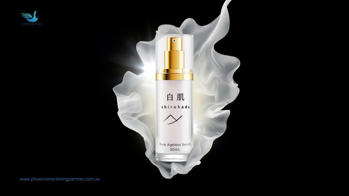
Color plays a critical role in shaping perception. For this reason, the design team selected a soft, neutral palette dominated by white and light beige tones.
These colors not only reflect skin purity but also enhance the product’s premium positioning. In addition, gentle gradients were introduced to create depth without overwhelming the design.
Typography was kept clean and modern. Furthermore, spacing and alignment were optimized to improve readability, ensuring that customers can quickly understand product information even at a distance.
When is brand repositioning optional and when is it mandatory?
4/ Structural design & packaging system
Beyond aesthetics, the structure of the packaging was carefully considered. Therefore, each element from box layout to label hierarchy was designed to create a seamless unboxing experience.
Moreover, the system was built with scalability in mind. This means new SKUs can be added without disrupting the overall visual identity.
Consistency, however, does not mean repetition. Instead, subtle variations were introduced across different products to maintain freshness while preserving brand coherence.
5/ Customer experience & retail impact
Packaging is often the first physical touchpoint between brand and customer. Therefore, the Shirohada packaging was designed to create an immediate emotional connection.
At retail, the clean and elegant design helps the product stand out among crowded shelves. As a result, it increases visibility and attracts attention without relying on loud visuals.
Moreover, the premium feel of the packaging enhances perceived value. Consequently, customers are more likely to trust the product and move closer to purchase decisions.
6/ Results & brand transformation
The final outcome is more than just packaging—it is a complete brand experience.
The Shirohada packaging system successfully elevates brand perception. In addition, it strengthens visual consistency across all touchpoints.
Most importantly, it creates a strong first impression. Therefore, the brand is able to compete more effectively in the premium skincare segment.
7/ Conclusion
The Shirohada project demonstrates that great packaging is not just about design—it is about strategy.
By combining minimalism, brand storytelling, and user experience, Phoenix delivered a solution that is both visually compelling and commercially effective. Ultimately, this project proves that when design is aligned with strategy, packaging becomes a powerful driver of brand growth
Is brand idenity design really that important?
At Phoenix, packaging design is not just about making something beautiful it’s about building long-term brand value. The Shirohada project is a testament to this belief: with the right design, a brand can speak volumes even before the product does.